

Mobile website checklist
A mobile website checklist you can run on your own phone in 15 minutes: speed, readability, buttons, forms, calls, maps and the popups that cost local businesses customers.
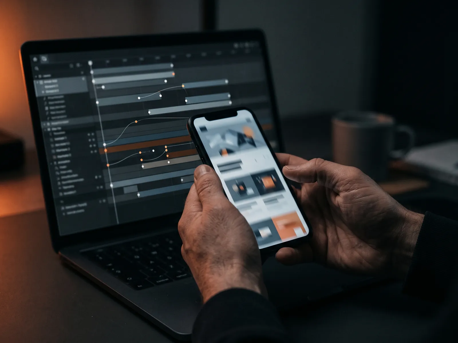
Most people who look up a local business do it on a phone, often standing in a kitchen with a leak, sitting in a parked car or waiting in line. This mobile website checklist covers what those visitors need: a page that loads quickly, text they can read without zooming, buttons they can hit with a thumb, a phone number one tap away and forms that do not fight the keyboard.
You do not need special tools to start. Take your own phone, ideally a mid-range one, switch off Wi-Fi so you are on cellular data, and open your website as if you had never seen it. Then work through the list below.
Why mobile matters more for local businesses
When someone searches for an emergency plumber, a dentist open on Saturday or a pizza place nearby, the phone is usually the device in hand. Google also evaluates websites mainly by their mobile version, a practice known as mobile-first indexing. If your mobile site hides content, loads slowly or is hard to use, it affects both visitors and how Google sees you.
Loading and speed
- Something useful appears quickly. The headline and main photo should show within a couple of seconds on cellular data, not a blank white screen.
- Images are sized for phones. A photo that is huge on a desktop does not need to be sent at full size to a phone.
- No autoplay video in the first screen. It eats data and battery and often delays everything else.
- Content does not jump. Banners and images that load late and push text down make people tap the wrong thing.
- Check your Core Web Vitals. PageSpeed Insights shows how real mobile visitors experience the site. The basics are in Core Web Vitals explained.
Readability
- Text is readable without zooming. Body text that feels comfortable at arm's length, with enough space between lines.
- Contrast is strong. Light gray on white disappears in sunlight. Dark text on a light background is safest.
- Short paragraphs. Two to four lines on a phone screen. Long blocks get skipped.
- Headings tell the story. Someone scrolling quickly should understand the page from the headings alone.
- No horizontal scrolling. Tables, images and embeds must fit the screen width or scroll inside their own box.
Navigation and buttons
- The menu opens on the first tap and closes easily.
- Buttons are big enough for a thumb, with space between them, so nobody calls when they meant to email.
- The main action is always close. A sticky call or book button at the bottom of the screen works well for service businesses.
- Links look like links. Underlined or clearly colored, not hidden in plain text.
- The logo leads home, and the back button works as expected.
Calls, messages and maps
- Phone numbers are tappable and open the dialer with the right number.
- Click-to-text or messenger links work, if you offer them, and open the right app.
- The address opens in maps. One tap from your contact page to directions.
- Hours are easy to find, including holiday changes.
- Your service area is clear for businesses that come to the customer.
Forms
- Fields use the right keyboard. Number pad for phone and zip code, email keyboard for email.
- Autofill works. Names, emails and phones should fill in with one tap from the phone's saved data.
- Labels stay visible while typing, not just placeholder text that vanishes.
- Errors are explained in plain words, next to the field that has the problem.
- The submit button is visible above the keyboard, and a clear confirmation appears after sending.
Popups and overlays: the silent conversion killers
On a phone, a popup can cover the entire screen. Google has long discouraged intrusive interstitials that block content on mobile, and visitors dislike them even more. Check what appears on your site in the first ten seconds: cookie notice, newsletter popup, chat bubble, promotional banner. If two or more of them stack up, the visitor sees boxes instead of your offer.
Keep cookie notices compact, delay or remove newsletter popups on mobile, and make sure the chat bubble does not cover your call button.
How to run the check
| Step | What to do | Time |
|---|---|---|
| 1 | Open your homepage on cellular data, count seconds to the first useful content | 2 min |
| 2 | Tap through the menu, the call button and one service page | 3 min |
| 3 | Fill in your contact form with real details and send it | 3 min |
| 4 | Turn the phone sideways and check nothing breaks | 2 min |
| 5 | Ask someone over 60 to find your phone number and hours | 5 min |
The last step is the most revealing. If an older relative struggles, so do many of your customers. Many of the same fixes also improve accessibility; see ADA website accessibility for the overlap.
Common problems I see on small business sites
- Desktop menus squeezed onto phones, with tiny links stacked together.
- Phone numbers placed as images, so they cannot be tapped.
- Hero sliders that take most of the screen and say nothing useful.
- Booking widgets that work on desktop but break on smaller screens.
- Forms that send, but show no confirmation, so people send them three times or give up.
Test on more than one phone
Your own phone is probably newer than many of your customers' phones. If you can, borrow an older Android device or ask a family member to try the site. Screen sizes, browsers and default text sizes differ, and something that looks perfect on a large new iPhone can wrap awkwardly on a small Android screen. Also try the site with the phone's text size set larger in accessibility settings; many older customers use that setting every day.
Building mobile-first
When I design a website, I start with the phone layout and then expand to desktop, not the other way around. It forces the important decisions early: what goes in the first screen, where the call button sits, how long the form is. Every page is tested on real phones before launch. If your current site fails several checks above and runs on an old theme, a website redesign may be cheaper than patching. If it is mostly fine, start with the quick fixes in the website conversion checklist. For speed specifically, see website speed optimization.
Let’s talk
about your business
Before the call I review your website and ads. After the call you get an action plan and a price range in writing.

12+ years in online marketing, 100+ clients. I build websites, Google Ads and Meta ads campaigns, CRMs and automations for small and mid-sized businesses. About me →
Mobile website
questions
How do I know if my website is mobile-friendly?
Open it on your own phone using cellular data and try to do what a customer would: find a service, read a price hint, call and send a form. PageSpeed Insights adds data on speed and layout stability. If any step is awkward for you, it is awkward for customers too.
Should my mobile site show less content than desktop?
Not less content, but better organized content. Google mainly uses the mobile version of your site for ranking, so hiding important text on mobile can hurt. Use shorter paragraphs, clear headings and expandable sections instead of removing content.
Is a sticky call button a good idea?
For most service businesses, yes. A small bar at the bottom of the screen with call and book buttons keeps the main action within reach while people read. Keep it compact so it does not cover content, and make sure it does not overlap a chat bubble.
Do I need a separate mobile website?
No. Modern sites use responsive design: one website that adapts its layout to the screen size. Separate mobile sites on a different address were common years ago and are now generally avoided because they duplicate content and complicate maintenance.
Find out how your site
feels on a phone
Send me your website address. I'll run this checklist on real phones and send you a short list of what to fix first, in plain language.